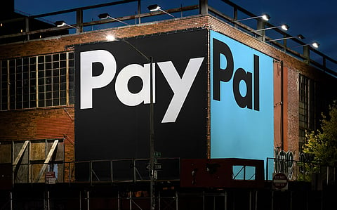
PayPal has launched a refreshed brand identity, signaling a new chapter in its journey as a global leader in digital payments. Designed by Pentagram, the new identity reflects a simpler, more modern, and optimistic vision for the brand. Over the last 25 years, PayPal has revolutionized the way we shop, sell, and move money, and this latest evolution brings a fresh approach to how the platform engages with customers.
PayPal's updated look is more than just a design overhaul—it’s a strategic move that underscores the company’s commitment to making payments and commerce easier and more rewarding for its users. The new brand identity includes a custom typeface called PayPal Pro, a refined color palette, and a motion language inspired by everyday payment actions like tapping, flipping, and swiping.
The design team at Pentagram crafted the new identity to reflect PayPal’s key values of simplicity, optimism, and trust. The refreshed logo remains recognizable, but the iconic PayPal monogram has been sharpened for a more modern look. The curves of the letterforms have been tightened, giving the logo more depth and dimension, while the use of contrasting blue tones pays homage to Venmo, PayPal’s popular mobile app.
Importantly, the PayPal symbol and wordmark are no longer locked together. This separation gives the brand more flexibility, allowing the logo elements to be used independently across various formats and mediums.
At the heart of the new identity is PayPal Pro, a bespoke typeface that represents the brand’s bold, confident approach. Based on the geometric simplicity of Futura, PayPal Pro brings a contemporary twist to timeless letterforms, emphasizing clarity and directness. A secondary typeface, PayPal Pro Text, is also being developed to ensure legibility and usability in small sizes across digital platforms.
While PayPal’s classic blue remains are central to its identity, the new color palette simplifies and streamlines the brand. The design eliminates the yellow tones from previous iterations and introduces black as a grounding color for key elements like payment buttons. This minimalist approach enhances the visibility of PayPal's branding, especially in digital interfaces.
Motion is also a crucial part of the new identity. Drawing on common payment gestures, such as swiping and tapping, the motion language adds a dynamic quality to PayPal’s visual branding, making it feel more intuitive and integrated into the product experience.