News & Updates

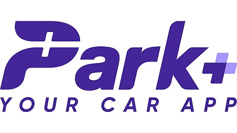
Discover the revamped logo of Park+, a symbol of innovation and convenience in the parking industry. As per the company, the three cornerstones of its new brand identity are Young, agile & ambitious.
The logo showcases a dynamic and fluid design, symbolizing movement, efficiency, and forward-thinking approach. The vibrant colours and clean lines embody a sense of modernity and innovation, capturing the essence of Park+'s commitment to providing cutting-edge parking solutions.
Alongside the new logo, Park+ has also introduced an enhanced user experience across its platforms. The revamped website and mobile app offer seamless booking, contactless payment options, and real-time updates on parking availability.