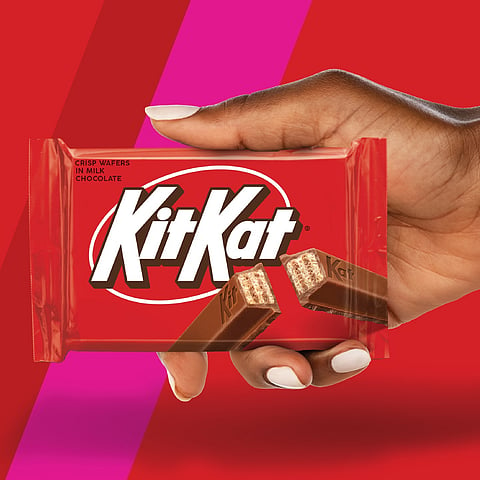
KitKat has joined the growing trend of retro-inspired logo redesigns, following in the footsteps of brands like Marvel's Fantastic 4, Pepsi, and DC Comics. However, KitKat's new logo, crafted specifically for the US market, is not a revival of an old design but a fresh take that blends nostalgic appeal with contemporary flair.
The updated logo, created in collaboration with New York City-based Sterling Brands, is designed to make KitKat stand out on store shelves while also evoking the familiar charm of a brand that has been a household name in the US since the 1970s.
The typography now has sharper straight lines, replacing the previous inner shadow with chunky drop shadows that make the logo pop against its signature red background. The text is more tightly kerned, and the ring around the wordmark is thinner and white, shifting away from the former yellowish hue to create a cleaner and more focused appearance.
Sterling Brands describes the rebrand as a celebration of KitKat’s "crispy, creamy taste," infused with the energetic vibe of the brand’s iconic "break." This design perfectly captures the retro modern trend, ensuring that KitKat feels both timeless and contemporary, appealing to both long-time fans and new consumers alike.